

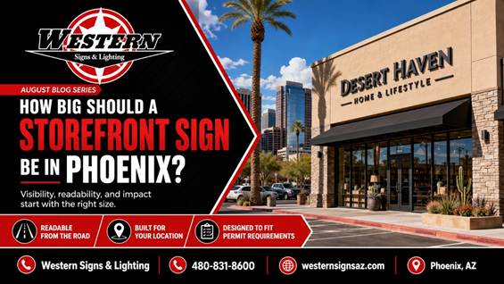
A storefront sign has one basic job. It must help people notice, identify, and remember a business. That sounds simple until the sign is placed above a shop facing a wide Phoenix road, a large parking lot, or a busy shopping center entrance. A design that looks bold on a computer screen can appear surprisingly small once it is installed.
Choosing the right storefront sign size requires more than measuring the empty space on the wall. Viewing distance, traffic speed, letter style, contrast, lighting, and permit limits all affect what customers will actually see.
Begin With the Real Viewing Distance
Stand where a customer will first approach the property. This may be across a parking lot, near a driveway, or several hundred feet down the road. The sign should be judged from that position rather than directly beneath the building.
A business facing a pedestrian walkway may be able to use smaller letters and more detail. A location beside a multi lane road usually needs larger lettering and a simpler message. Trees, light poles, parked vehicles, awnings, and neighboring signs can also block part of the view.
The sign should remain easy to recognize while someone is moving. Drivers do not have time to study several lines of text. They need to understand the business name quickly and know where to turn.
Make the Business Name the Main Message
Many storefront signs try to say too much. The company name, slogan, phone number, web address, and list of services may all compete for space. From the road, smaller details often become visual clutter.
The strongest signs give the business name clear priority. A short description may help when the name does not explain what the company does, but it should remain secondary.
Choose Contrast for Arizona Sunlight
Phoenix sunlight is unforgiving. Colors that look attractive indoors may lose definition on a bright exterior wall. The letters need a clear contrast with the surface behind them.
Dark letters often work well against a light building, while white or brightly illuminated letters can stand out against darker materials. Similar shades may blend together.
It is also worth checking the building at different times of day. Morning shadows, afternoon sun, reflective windows, and nearby lighting can all change the way a sign appears.
Plan for Nighttime Visibility
A business that operates after dark needs a sign that remains clear once daylight fades. Channel letters, illuminated cabinets, and other LED sign options can make the storefront easier to find from the street.
The lighting should be even across the entire sign. Dark letters, patchy illumination, or a weak transformer can make an otherwise good sign look neglected. The design should also avoid excessive brightness that makes the letters uncomfortable to read.
Check Sign Rules Before Finalizing the Size
Available wall space does not always equal permitted sign space. City regulations may control the sign area, height, placement, projection, and lighting. Shopping centers and landlords may also have their own sign criteria.
These details should be reviewed before fabrication. Changing an approved design is far easier than altering a completed sign. A full service sign company can coordinate the design, landlord approval, permit drawings, fabrication, and installation.
Get a Storefront Sign Designed for the Street
The right sign is not simply the largest one that fits. It is the one that reads clearly from the customer’s approach, works with the building, meets local requirements, and presents the business with confidence. Western Signs and Lighting designs, fabricates, permits, installs, and maintains commercial signs throughout the Phoenix Valley. Call 480 831 8600 for a free storefront sign estimate and practical guidance for your location.
References
Western Signs and Lighting Outdoor Signs
Western Signs and Lighting Sign Process